On this page
- What this is for
- How to get here
- The sessions list
- The session hub — the header and the four-entry menu
- Overview
- Telemetry
- Video
- AI Coach
- Turn Analysis
- Empty, loading and error states
- Walkthrough: get the run you have just finished onto your phone
- Walkthrough: find where you lost time, and ask about it
- Where to next
Trackside Sessions — the session hub at the circuit
Between runs you have five minutes, one hand free and a phone. The trackside session hub is built for exactly that: a list of everything you have uploaded, and inside each session five screens that answer one question each — what happened, what the telemetry says, what the video shows, what to work on, and what went wrong at one particular corner.
This chapter covers trackside — the phone-first Apex app you use at the circuit. For sessions on a laptop — bulk upload, the full lap-times table, comparing four runs side by side — see Sessions; this chapter covers the phone.
Throughout this chapter we follow Jordan Miles, our demo driver — an EKS Eagle at Go Kart Club of Victoria.
The session we follow is a practice run at Ipswich Kart Club on 15/09/26 — 13 laps, best lap 0:50.391. One picture in this chapter is from a different day at a different circuit, and it says so where it appears.
What this is for
Use the session hub to:
- Find a run you have uploaded, by track, by date or by how fast it was.
- Get a session off your logger and into Apex without opening a laptop.
- See where the time went on your best lap, corner by corner.
- Ask about one corner in particular, and get something to try next time out.
How to get here
Tap Sessions in the bottom tab bar. That is the list. Tap any session card and you are in the hub for that session, which opens on Overview.
Six screens live under this chapter, and they are not all reached the same way:
| Screen | How you get there |
|---|---|
| The sessions list | Sessions in the bottom tab bar |
| Overview | tap a session card — it is the hub's opening screen |
| Telemetry · Video · AI Coach | the menu across the top of the hub |
| Turn Analysis | not in the menu — you reach it from a corner you tapped |
The sessions list
What this is for
Everything you have uploaded, newest first, grouped by the day you ran it — and the one control that gets a new session in.
How to get here
Tap Sessions in the bottom tab bar.
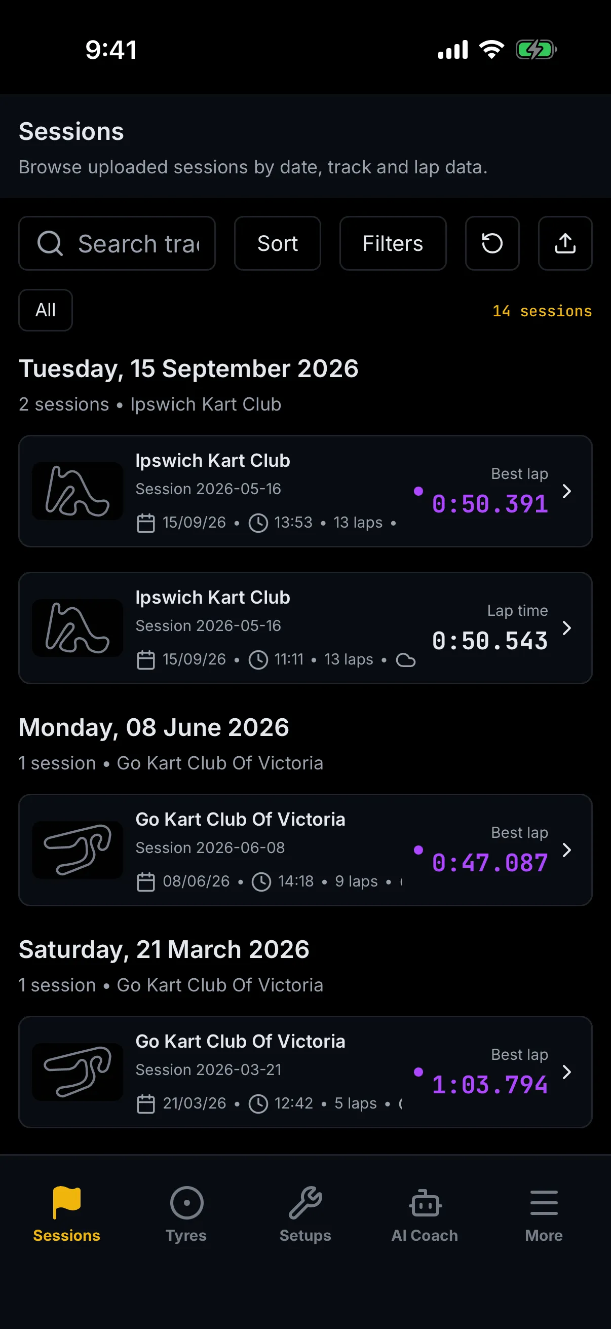
Every element
The toolbar
Five controls in one row across the top:
- Search — a field reading Search track, date or session…. Type and the list narrows as you go; it waits a fraction of a second after you stop typing, so it does not flicker under your thumb.
- Sort — three choices: Newest first, Oldest first, Fastest lap.
- Filters — opens a panel headed Session type with five chips: All, Practice, Qualifying, Race and Test.
- Refresh — the circular arrow. Fetches the list again.
- Upload — the tray-and-arrow at the right-hand end. See Adding a session from your phone below.
Search, sort and filter all work on the sessions Apex has already sent to your phone, so they are instant and they work with a poor signal.
The chip rail and the session count
Beneath the toolbar sits a rail holding a single chip, All, and on the right the count — 14 sessions in the picture above. Filter the list and the count changes shape to tell you both numbers, for example 3 of 14 sessions.
There is one chip and that is deliberate. The list Apex sends your phone does not carry whether a session is a favourite or whether it has video, so chips for those two would have nothing to filter on. Filters and Search are where the real narrowing happens.
Date groups and session cards
Sessions are grouped under the day you ran them — Tuesday, 15 September 2026 — with a subtitle giving the count and the circuit, for example 2 sessions • Ipswich Kart Club. A session with no usable date is grouped under Undated.
Each card carries the track's own layout as a thumbnail, the track name, the session's name, then the date, the time of day and the lap count. On the right is that session's own best lap time — every card shows its own. What changes between them is the label and the colour:
- Best lap, in purple with a dot beside it — the fastest session of that day;
- Lap time, in plain white — every other session in the group.
So a card reading Lap time is not a worse session than one reading Best lap on another day. It only means another run that same day was quicker. Sort by Fastest lap and the day grouping falls away entirely — the list becomes one ranked run of sessions, and only the outright fastest takes the purple treatment.
A session still processing or one that failed never takes it, whatever its time.
Tap the card to open the session.
Adding a session from your phone
The Upload button takes an .xrk or .xrz straight off your logger. It opens your phone's own
file picker, not an Apex screen — on an iPhone that means Photo Library, Take Photo or Video
and Choose File.
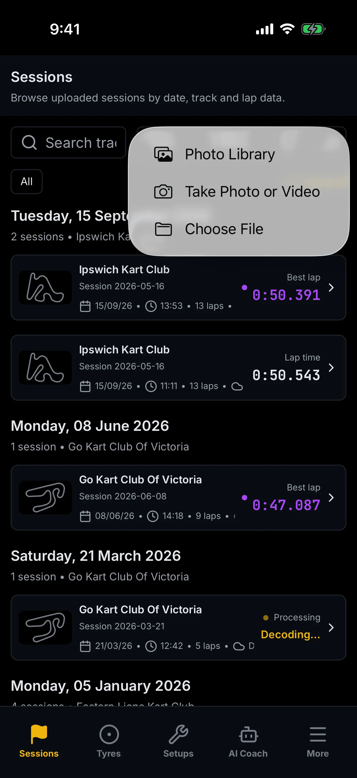
Pick the file and Apex covers the screen while it works, with a dialog headed Uploading session and then Upload complete — and then it opens the new session for you. You do not have to go back and find it.
Two other headings are possible, and they mean different things:
- Upload failed — the file did not go up. The dialog says why, and offers Try again.
- Monthly session limit reached — you are out of session allowance for the month. Nothing was uploaded, and there is no Try again, because trying again will not help. The line beneath reads "N of M sessions used this month. Add a pack or upgrade to upload more."
If a card in the list shows an amber Processing dot and the word Decoding, the file is up and Apex is still reading the channel data. The session opens and works; the detail fills in behind you.
The session hub — the header and the four-entry menu
Every screen inside a session sits under the same two pieces of furniture.
The header
The header carries a ‹ Sessions back link, a title, a subtitle, and a row of details: the date, the lap count, the track temperature and the conditions. The back link always goes to the list, from every screen in the hub.
What the title says depends on where you are:
- On Overview it is the session's own name — Practice — followed by a coloured status dot, with the circuit beneath.
- On Telemetry, Video and AI Coach it is the screen's name, the subtitle becomes session name • circuit, and there is no dot. It is not missing; those screens do not carry it.
The status dot is the import's state, and its wording is worth knowing:
| Dot | Means |
|---|---|
| Complete | everything is in |
| Analysing | laps and times are in; the corner-by-corner analysis is still running |
| Browsable | enough is in to look around |
| Processing | still working |
| Failed | the import did not finish — see If the session did not process |
Two buttons sit at the top right. Share session works: it hands the session's link to your phone's share sheet, or copies it and tells you Link copied.
The ⋮ beside it opens nothing. It is drawn, it takes focus, and it has no menu behind it yet. It is not the only one — the GPS pill and the expand arrows on Overview's track map are the same, and so are the three cards under Top Time Losses. Each is called out where it appears. If a control on these screens does not respond, it is far more likely to be one of these four than anything you have done.
The four entries
Across the top of the hub, four entries — and there are four, not five:
Overview · Telemetry · Video · AI Coach
The one you are on is lit. Overview is the screen you land on.
Turn Analysis is not in the menu, and that is deliberate
There is a sixth screen, Turn Analysis, and it has no entry in that menu. You reach it by tapping a corner you are already looking at:
- View Insight, next to the Focus Corner on Overview;
- All Corners, in the Top Time Losses header on Overview;
- any row under Sector Analysis on Telemetry;
- any row under Key Moments on Video;
- View Sector Detail, under Related Moments on AI Coach.
A driver who cannot find Turn Analysis in the menu is not lost — it is a screen about one corner, so it is reached by naming the corner. Its back link takes you to whichever screen you came from.
Overview
What this is for
The session at a glance: what your best lap was, where the time went, and which corner is worth your attention.
How to get here
Tap a session card in the list. Overview is the hub's opening screen.
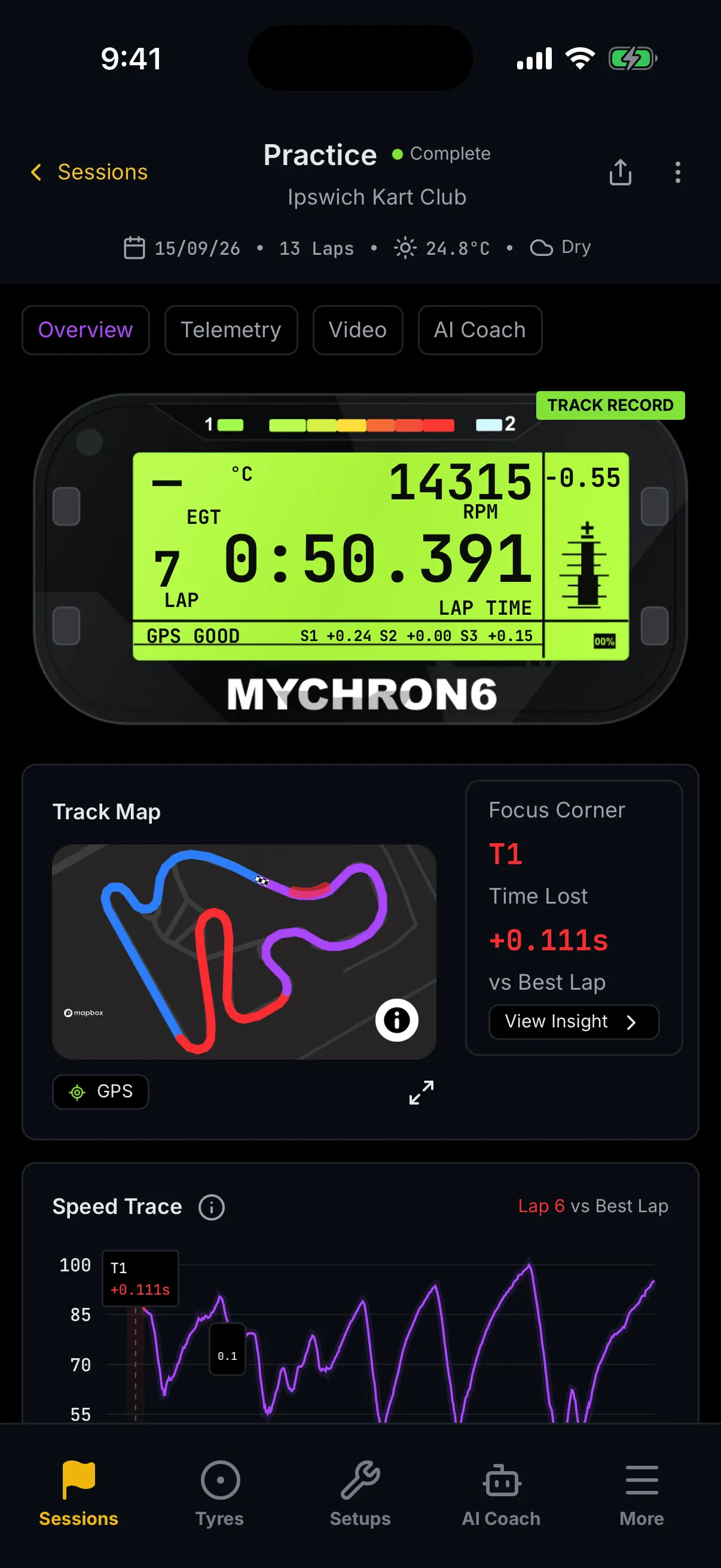
Every element
If the session did not process
When the import failed, a line reading Processing failed sits above everything else, with whatever the importer reported beneath it — or "The telemetry import did not complete." if it said nothing. The rest of the screen still renders with what did arrive.
The MyChron6 dash
The panel at the top is drawn to look like the dash on your logger, and it shows your best lap: the lap number, the lap time, peak RPM, the exhaust-gas temperature, a predictive delta, and the three sector deltas along the bottom. A green TRACK RECORD badge appears when the session set one.
Two things on it are not what they look like:
GPS GOODis part of the picture, not a reading. It is fixed text. The dash does not report your GPS quality, and it will sayGPS GOODwhatever the fix was like.- An empty reading shows an em dash. In the picture above EGT reads
—, because this session carries no exhaust temperature. That is the absence of data, not a temperature of zero.
Track Map and Focus Corner
The map draws your lap over the circuit, with the one segment that cost you most ringed in red. Beneath it are a GPS pill and a pair of expand arrows — neither does anything yet.
To the right, the Focus Corner column names that segment, gives the Time Lost against your best
lap, and offers View Insight ›, which opens Turn Analysis for it. With no analysis yet it reads
No insights yet and the time shows —.
Speed Trace and the sector strip
Speed Trace plots your comparison lap's speed against your best lap over the lap's distance, with the caption on the right naming the lap — Lap 6 vs Best Lap. The ⓘ beside the heading explains it in two sentences: the shaded band marks the sector where most time is lost, and the strip beneath shows time gained or lost per micro-sector.
The comparison lap is chosen for you: the second-fastest clean flying lap, preferring one the corner analysis actually covers. You are always looking at your best lap against your next-best.
Beneath the chart runs the sector delta strip — one cell per micro-sector, in lap order, each with its label, the time gained or lost to two decimal places, and a coloured bar: green for time gained, amber for a small loss, red for a big one.
On Overview the strip is a read-out. On Telemetry the same strip is tappable. They look identical.
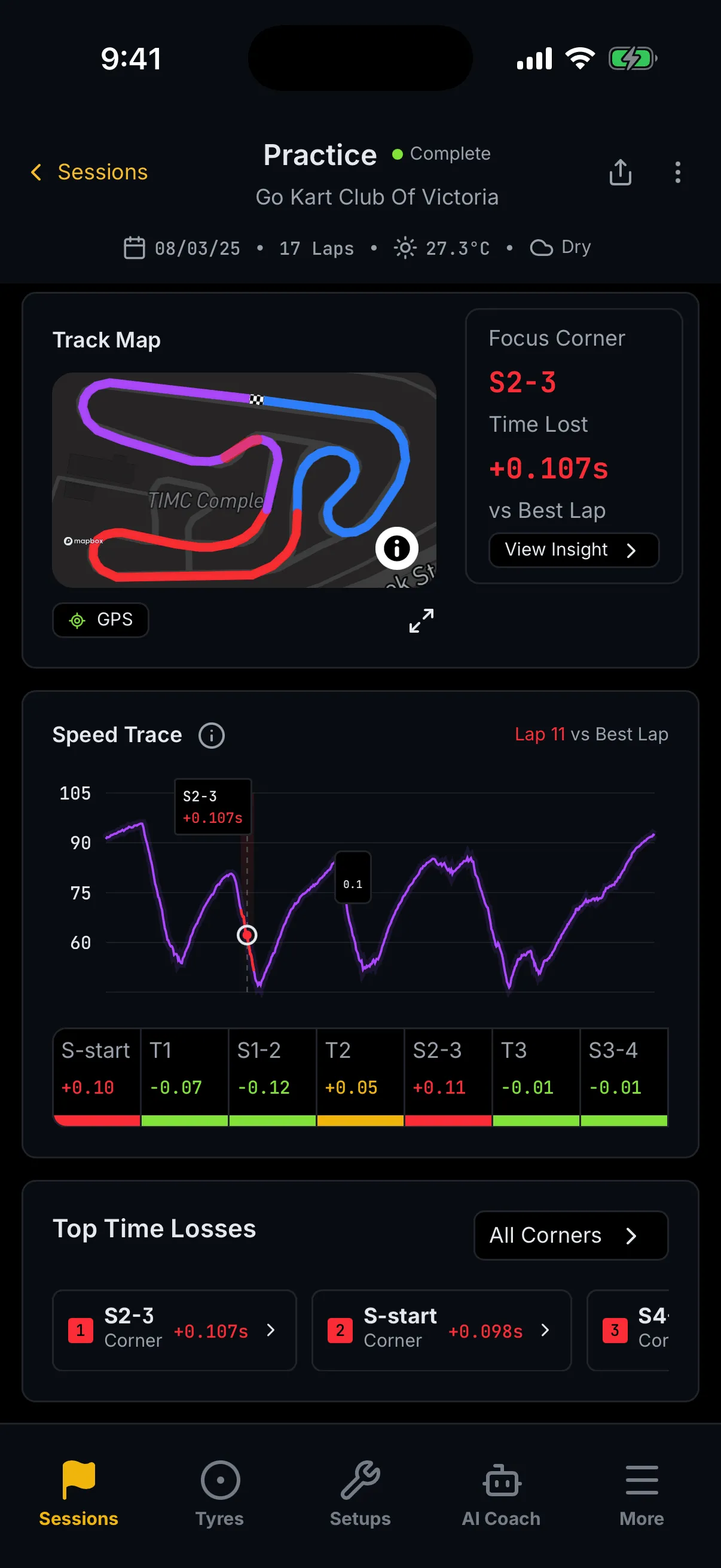
The picture below is a different session — a practice run at Go Kart Club Of Victoria, 17 laps, on 08/03/25 — because its Focus Corner is an inter-corner sector (S2-3) where the Ipswich session's is a corner (T1). Both appear in these lists, and it is worth seeing one of each.
Top Time Losses
The last card ranks the three segments that cost you most, each with a coloured rank badge, the corner or sector, which part of it (Entry, Exit, or Corner for a whole segment) and the time. The row scrolls sideways if the third does not fit.
The cards themselves do nothing. They carry a chevron and they look tappable; they are not. Use All Corners › in the card's heading to open Turn Analysis.
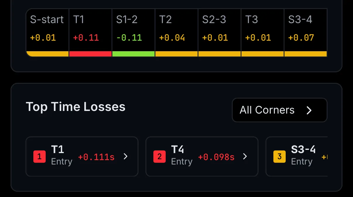
With nothing to rank, the card reads No time losses identified.
Telemetry
What this is for
Two laps, one channel at a time, and a ranked list of where the difference came from.
How to get here
Tap Telemetry in the hub menu.
Every element
Compare Laps
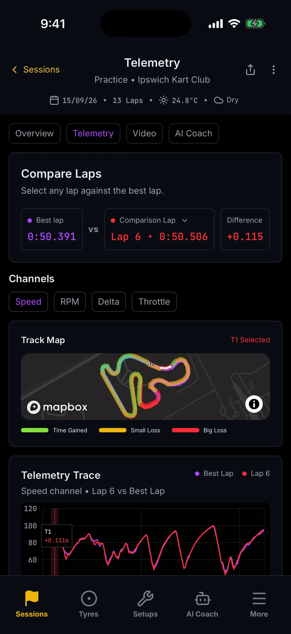
Three tiles under the heading and the line Select any lap against the best lap.: your Best lap, the word vs, and the Comparison Lap — then the Difference between them.
The comparison lap starts as the one Overview chose. Tap it and a list opens — your flying laps,
fastest first, with the best lap itself left out, because comparing the best lap with itself is not a
comparison. Out-laps, in-laps and any lap that did not complete are not offered either. Pick one and
the whole screen recomputes against it. With no second flying lap there is nothing to pick, and the
tile reads —.
Channels
Up to four chips: Speed, RPM, Delta and Throttle. Only those your logger actually recorded appear — if the session carries none of them the whole Channels section is absent, which is why you may not see it at all. Delta is not a channel from the logger; it is the running time difference between the two laps, worked out from the session's own analysis — so it appears only once that analysis has produced enough to draw.
Track Map
The whole lap, every micro-sector coloured by how it went, with the selected sector drawn over the top in white. The caption on the right names it — T1 Selected. The legend is three swatches: Time Gained (green), Small Loss (amber), Big Loss (red).
Telemetry Trace and the sector strip
The chart plots the chosen channel for both laps — your best in purple, the comparison lap in red — with the subtitle naming both, for example Speed channel • Lap 6 vs Best Lap. On the Delta channel the subtitle adds its unit, (s), because that one is measured in seconds.
The sector delta strip sits beneath it again — and here the cells are buttons. Tap one and the map, the chart's marker and the selected-sector caption all move to it. This is the same strip that is read-only on Overview.
Sector Analysis
A ranked list of every micro-sector, with a pill that toggles between Top 3 and All sectors. Each row gives the rank, the sector, how bad it was — Biggest loss, Big loss, Small loss, and Time gained once the list is expanded — and the time. Tapping a row opens Turn Analysis for that sector, and the back link there will read Telemetry.
With nothing to rank it reads No time losses identified, the same words Overview uses.
Video
What this is for
Your onboard footage, and the 3D replay of the same lap, side by side with the rest of the session.
How to get here
Tap Video in the hub menu.
Every element
Onboard Video
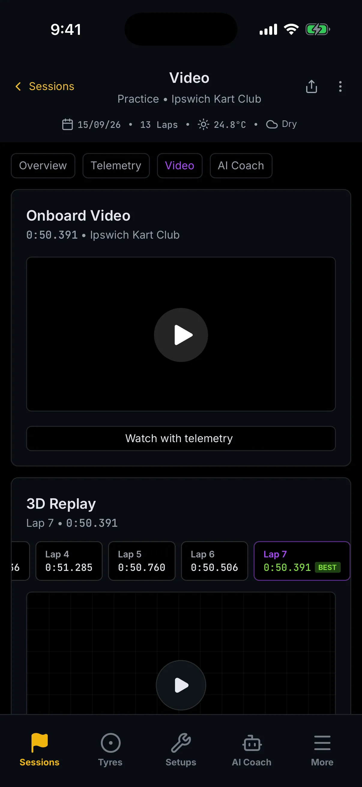
Headed Onboard Video, subtitled with your best lap time and the circuit. If the session has footage you get a player you can scrub. If it does not, you get a tile reading No onboard video for this session — which is a statement about this session, not a fault.
The card is titled for the session rather than for a lap, because Apex does not yet know which lap a piece of footage belongs to.
Watch with telemetry — this one leaves trackside
The full-width Watch with telemetry button opens the synchronised player, and that player is a dashboard screen, not a trackside one. Expect the layout to change under you. Your phone's back gesture brings you back.
3D Replay
Beneath the video sits 3D Replay — the lap flown as a 3D chase cam. A rail of lap chips runs across the card, the fastest badged BEST; below it the replay itself, with a transport, a camera switcher and Ghost and Overlays toggles.
It does not load until you tap it. Until then it shows a poster and the line Tap to load the 3D replay, which is deliberate — it is the heaviest thing on the surface and it does not start on a screen you were only passing through.
It needs near-continuous GPS. Without it the card says so — "A 3D replay needs near-continuous GPS. Lap times and telemetry are unaffected." — and everything else on the session is untouched.
3D Replay has a chapter of its own, which is not written yet.
Key Moments
A ranked list of the corners worth watching, with a pill toggling Top 3 and All moments. Rank 1 is described as the Biggest time loss; the rest are a Small loss or Time gained. Tapping a row opens Turn Analysis, and the back link there will read Video.
The whole card is absent when no corner lost time. It is not empty — it is not there.
AI Coach
What this is for
One page that says where you lost most, why, and what to try on the next run — and a place to ask about it in your own words.
How to get here
Tap AI Coach in the hub menu.
Every element
The briefing is worked out on your phone
Read this before the rest of the screen. Everything above Ask the Coach — the summary, the opportunity, the map, the action plan, the related moments — is worked out from your own session data on your phone. It is instant, it works with no signal once the session is loaded, and it costs you nothing.
Ask the Coach, at the foot, is the opposite: your question leaves your phone and the AI coach answers it. It needs a signal, it needs a plan that includes coaching, and each answer uses a credit.
They sit on one screen and look like one feature. They are not.
AI Session Summary
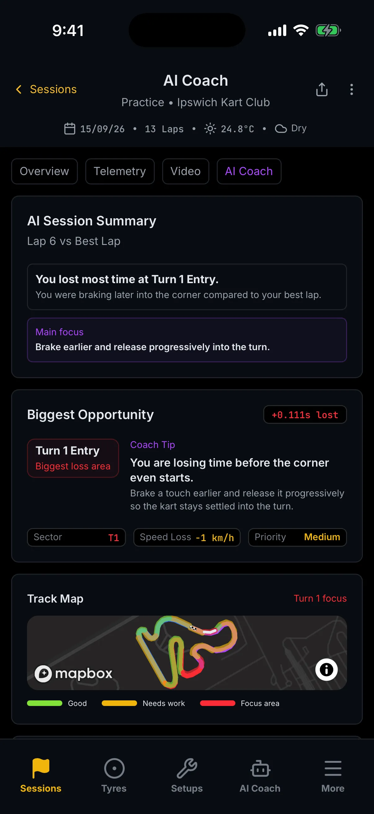
Captioned with the two laps being compared. A headline naming the corner — "You lost most time at Turn 1 Entry." — a sentence on what the data suggests, and a tinted panel labelled Main focus with the one change to make.
With no corner analysis yet, this card reads No analysis available for this session yet. and the four cards below it do not appear at all.
Biggest Opportunity
The same corner, in more detail: a badge with the time lost, the corner marked Biggest loss area, a Coach Tip in two parts, and three pills — Sector, Speed Loss in whole km/h, and Priority, which reads High, Medium or Low.
Track Map
The lap coloured by how each part went, captioned with the corner in focus. The legend here is worded for coaching rather than for timing: Good, Needs work, Focus area.
Action Plan for Next Lap
Three numbered steps, each a heading and a line of detail — what to change, and what it should feel like.
Related Moments
Tiles that take you to the same corner on another screen: Open Telemetry, View Sector Detail, and — only when the session has footage — a tile offering to watch that corner.
Ask the Coach — this one is a real request, and it costs a credit
A chat scoped to this session. It opens with Ask anything about this session. and a row of starter questions, the first of which is about the corner you are already looking at. Type in the field marked Ask the coach… and send.
Three things can come back instead of an answer, and they are not the same problem:
- Your plan does not include coaching. The chat is replaced by AI Coach is available on plans with coaching. and "Upgrade your plan to ask the coach about this session." Nothing you type will help; the plan is what changes it.
- Your coaching credits are used up. A line appears under the box: Coaching credits used up — top up to continue. The chat stays where it is. Top up and it works again.
- Something else went wrong. "Couldn't get a response — check your connection and try again." Your question is kept, so you can just send it again.
Turn Analysis
What this is for
One corner, in full: how much it cost, what went wrong, and what to do about it.
How to get here
You do not find this one in a menu. Tap View Insight or All Corners on Overview, a Sector Analysis row on Telemetry, a Key Moments row on Video, or View Sector Detail on AI Coach.
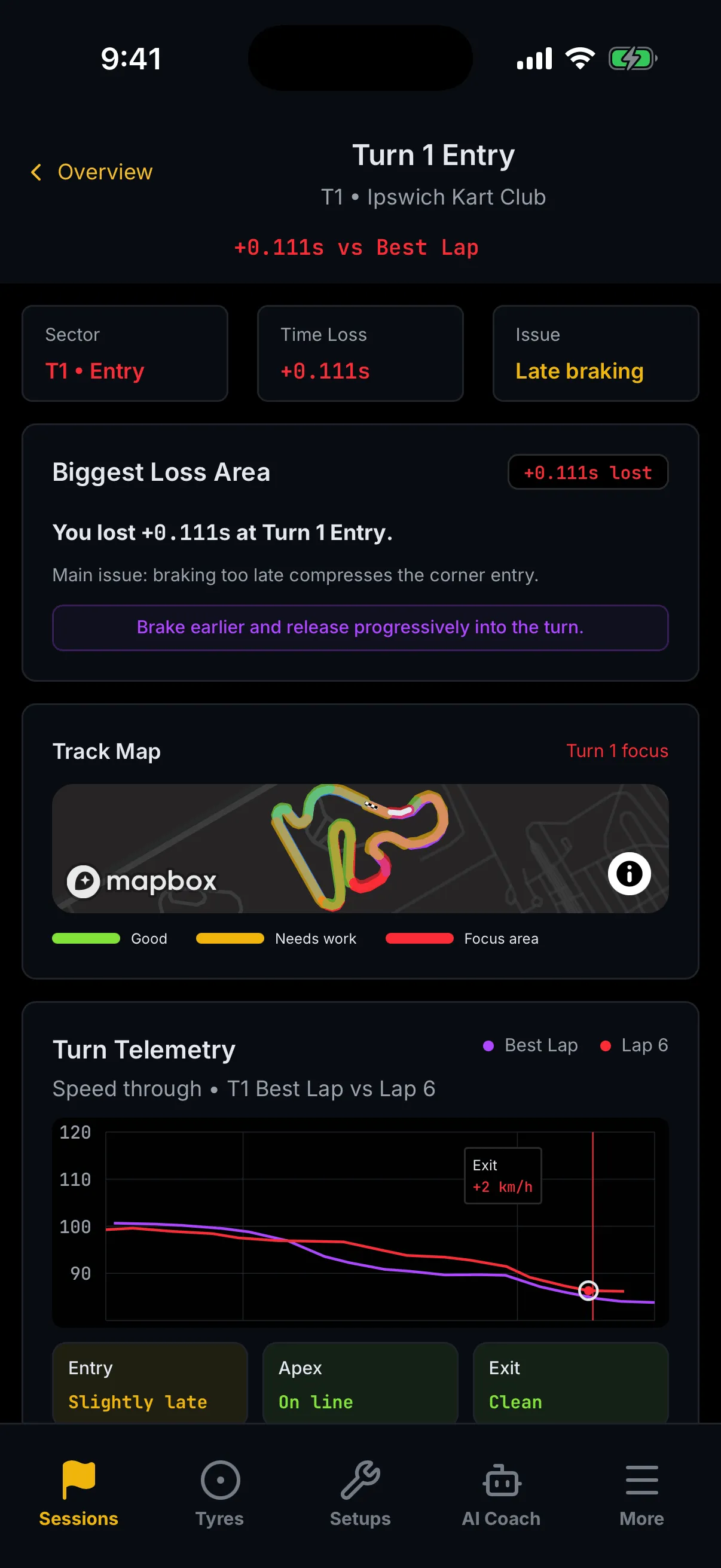
Every element
Sector, Time Loss and Issue
Three tiles across the top. Sector names the corner and which part of it; Time Loss is the time against your best lap; Issue is the one-phrase diagnosis, for example Late braking.
Above them the header names the corner, the circuit, and the time lost — and the back link names the screen you came from, not the list. In the picture it reads ‹ Overview.
Biggest Loss Area
The same figure written out — "You lost +0.111s at Turn 1 Entry." — the main issue in a sentence, and a highlighted line with the change to make.
Track Map
The lap again, with this corner in focus, and the same Good / Needs work / Focus area legend the AI Coach screen uses.
Turn Telemetry — Entry, Apex and Exit
Speed through this corner only, your best lap against the comparison lap, with markers where the two diverge. Beneath it three tiles, one per phase of the corner:
| Phase | What the words mean |
|---|---|
| Entry | Stable · Slightly late · Late |
| Apex | On line · Slightly late · Late |
| Exit | Clean · Losing speed · Lost speed |
They are graded on how much speed you gave away, so a corner where nothing was measured reads as the good case rather than inventing a problem.
Driver Feedback
The same three phases again, each with a sentence of plain-English feedback. The card is absent when there is no corner to talk about.
The three tiles at the foot
Full Telemetry takes you to the Telemetry screen with this corner already selected — the tile even names the trace you are about to see. Back to Coach and Watch Video go to their screens plainly, without carrying the corner: the AI Coach screen then shows whichever corner it rates your biggest opportunity, which is usually but not always the one you came from. Watch Video appears only when the session has footage.
Empty, loading and error states
Trackside is built to show you what it has rather than to wait for everything.
- While it loads, cards show a soft pulsing block rather than a spinner. The dash fills in slot by slot.
- While the import is still running, the screens keep showing loading blocks instead of empty ones, so "not here yet" is never mistaken for "nothing was recorded". The header's status dot is the thing to watch.
- Where a single figure is missing, you get an em dash —
—. - Where a whole card has nothing to show, it says so in a line: No insights yet, No time losses identified, No sector analysis yet, Awaiting laps, No telemetry for this lap, No track map, No onboard video for this session.
- Where a card would be meaningless, it is not rendered at all — Key Moments with no losses, the Channels row with no channels, the AI Coach cards with no analysis.
- If a session will not load, you get Couldn't load this session. and "Check your connection and try again."
- If a whole screen fails, you get Something went wrong, a Try again button, a Trackside home button and a short error reference.
- On the list, a failure reads Couldn't load sessions with a Retry pill; no sessions at all reads No sessions yet; and a filter that matches nothing reads No sessions match with a Clear filters pill.
Walkthrough: get the run you have just finished onto your phone
- Tap Sessions in the bottom tab bar.
- Tap the upload button at the right-hand end of the toolbar. What you'll see: your phone's own file picker, not an Apex screen — on an iPhone, Photo Library, Take Photo or Video and Choose File.
- Tap Choose File.
- Pick the
.xrkor.xrzoff your logger. What you'll see: a dialog headed Uploading session naming the file and its size. - Wait. What you'll see: Upload complete, and then Apex opens the new session on Overview.
- If it says Monthly session limit reached, stop — you are out of allowance for the month and nothing was uploaded. If it says Upload failed, tap Try again.
Walkthrough: find where you lost time, and ask about it
- Tap Sessions in the bottom tab bar.
- Tap today's session card. What you'll see: Overview, with the dash at the top and Overview lit in the menu.
- Read Focus Corner on the Track Map card. What you'll see: the corner that cost you most, and the time it cost.
- Tap View Insight ›. What you'll see: Turn Analysis for that corner, with a back link reading ‹ Overview.
- Read the three tiles under Turn Telemetry — Entry, Apex and Exit.
- Tap Back to Coach at the foot of the screen. What you'll see: the AI Coach screen, focused on the same corner.
- Read Main focus, then Action Plan for Next Lap. What you'll see: one change to make, then three steps to make it. Nothing so far has cost you a credit — all of it was worked out on your phone.
- Optional. Tap the first starter question under Ask the Coach. What you'll see: an answer written for this session — and this step, unlike every step above it, uses a coaching credit.
Where to next
- Sessions — the same sessions on a laptop: bulk upload, the full lap-times table, and comparing runs side by side.
- Trackside Tyres — the pressure calculator on the same phone.
- Review a session in detail
- Ask the AI Coach
- Rename a session or change its type
- Unfamiliar word? See the Glossary. Stuck? See Troubleshooting & FAQ.